
“Design is thinking made visual.”
- Saul Bass
“Whether it's graphic, live-action or a combination of both, I approach each assignment with the same basic question, "what's the message?" There has to be a logical (and hopefully, aesthetic) answer to that question. Otherwise, there is no design.”
Broadcast Design
These design examples represent a fraction of my past projects. Much remains on either obsolete storage (Syquests & Xbyte tapes) or worse yet, film! These images are remnants of what is readily available on my local drives. Some were realized, some weren't; I like them all!

FX asked me to pitch some promos for "Sunny". They provided the end-tag and most excellent copy. I lovingly provided the visuals.

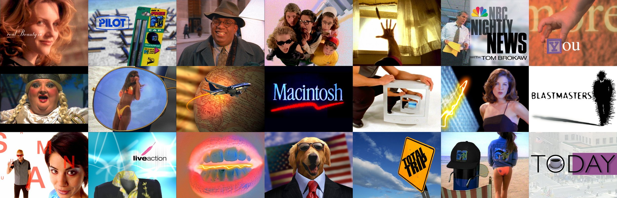
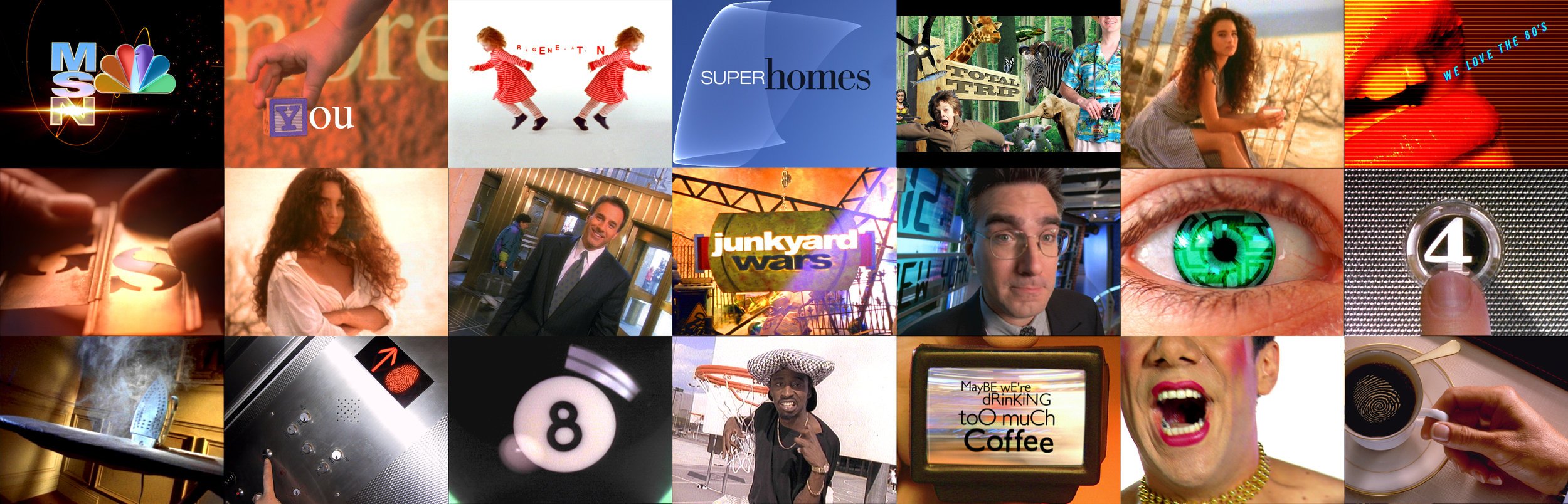
- A warm & fuzzy look for a subset of NBC's PSA franchise, "The More You Know".

- Among some new looks for NBC's "Today": relatable morning images framed by the "O". Good mOrning!


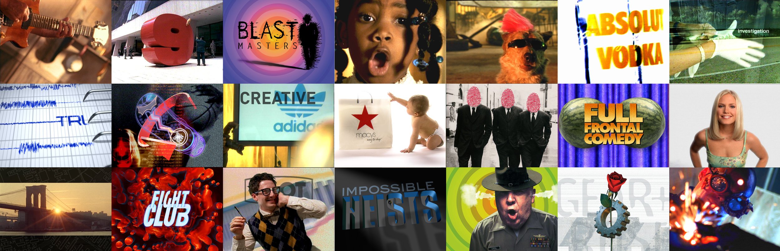
Court TV asked for rebranding pitches. I offered a few different ones. I liked the thought of thumbprints showing up in unusual places.
- POP Display for Patrick Ewing's "Vent" shoe...It sucked air from the front and blew it out the back - making for cool feet on the court.

Why Pittard/Sullivan subcontracted me to design & direct this show open, I'll never know. Part of my duties was to redesign the title. It was nominated for a Daytime Emmy - go figure... At least it made my mom proud :)

- A show about "big boys' toys" (fast cars, jetpacks, etc.). TLC's creative brief: sell it with sex! Babeage and heavy metal... What could go wrong?
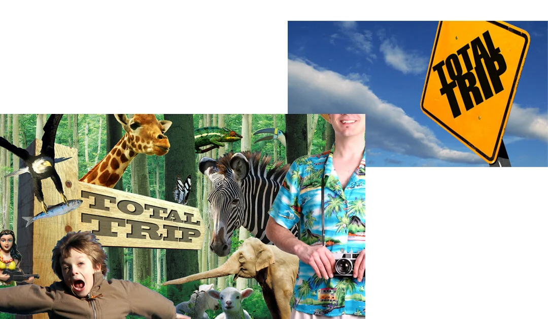
I _think_ these were for a Travel Channel show with Timothy Leary...

Title pitches for a TV show about high-end international homes.

My first assignment from NBC Advertising & Promotion: redesign the 'end-stack' graphics for Nightly News.

Some ideas for TLC's BlastMasters - a show about blowing things up... The show covered three sectors where explosions were used: Movies, Military and Demolition. Why not explode the exploders?


Showtime's soft-porn comedy show featured naked female hosts(!). Jim Twohie wrote & produced the VO/Audio. I delivered the visuals..

The best staff job I've ever had was at VideoWorks. They repped me as a Commercial Director while on non-shoot days, I functioned as their Art Director. I designed their print ads & other materials, as needed.
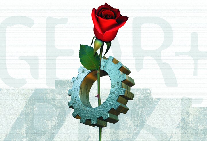
"Beauty Through Technology" was my headline for Gear+Rose Films - a spinoff company from VideoWorks.

Corporate Events + Trade Shows
Early in my career, I was an Art Director for Image Stream, a boutique production company in Los Angeles. We made slideshows for corporate events. Apple was our biggest client. Having done shows for the Apple II, Lolly and Lisa, we were charged with producing the launch for a new computer called "Macintosh." Who knew?
I was in Cupertino one day with Photographer Tony Korody, shooting 'motor-drive' sequences, when I met Susan Kare. She designed all the original desktop icons. The initial type branding for the Mac was Times Roman, compressed at 85%. With the logotype on the black & white screen, Susan showed us the Airbrush Tool in MacPaint. With a flick of her mouse, she whipped out a 'squiggle' underneath "Macintosh". We were blown away! I asked, "May I have a print of that?" The dot-matrix printer spit out a sheet. I returned to LA, made the type white, the 'squiggle' red, gave it a black background, and the show graphic was born!
After the Mac came to market, I walked into a computer store and noticed this graphic as a decal on the front door. I guess they liked my work;)
Jack In The Box Annual Sales Meeting. Given a few different headlines, I designed a few different show graphics.

Giving computer chips warmth & humanity...

Get'em while they're young!

Round logo, round radio waves, round picture frames. Round.
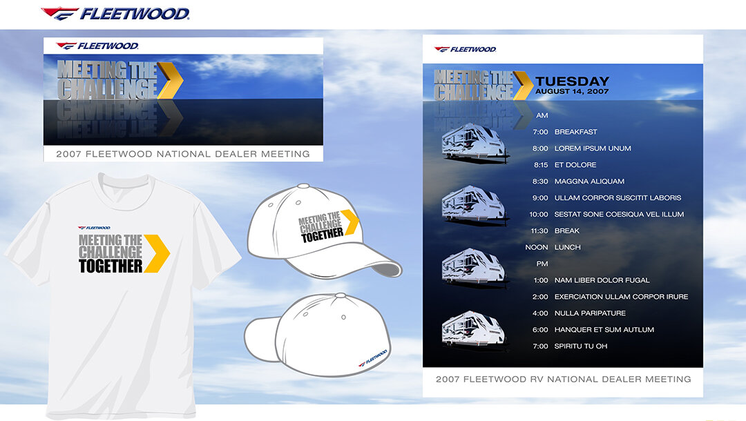
Fleetwood Motor Homes. I designed the show logo, show menu and various usages.
Music Video Pitches
Throughout the 90s, typical video pitches consisted of a brief paragraph written by a director describing their vision - occasionally accompanied by a few tear sheets for visual reference. I was among the first to pitch with Photoshop 'style boards' and written scene descriptions. I'd pull art from promotional materials & fabricate the rest.
Who wants to read when they can look at pictures? Besides, the musicians were often too stoned to read anyway.

This was for Pat Metheny's "Longest Summer" on his album, "Secret Stories". I got the gig!

My first music video! Yomo+Maulkie "Mama Don't" - a light little ditty about crack mothers and child abuse. It was real.

As a fan of Shawn Colvin, I reeeally wanted to do this video for her "Round of Blues".

Kym Sims' "Too Blind To See It" was a dance tune and my first pitch. It had eye charts and a seeing-eye dog. Vision’s underrated.

"You can't fight the armed forces" was one of many impossibilities discussed in Was (Not Was)'s "Shake Your Head" featuring vocals by Ozzy Osbourne & Kim Bassinger - wow.

The Spin Doctors, "Two Princes" - a classic tale of choosing between an artist with heart or businessman with money...
Logo Design
To effectively distill a single thought into an icon or mark is a unique art form. I've done several. Below are a couple of recent efforts

Movium is a premium service startup offering first run movies to home screens.


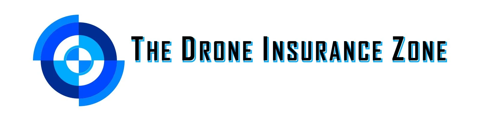
- A logo animation welcoming visitors to The Drone Insurance Zone website.

Personal Work

When I decided on the name, Fred+Ethel, I could have gone for the obvious, retro-TV angle. Yet, I wanted something a bit edgier. " I wondered, "what if Fred was Ethel (and Ethel was Fred)... A CROSS-DRESSER!" Of course, I could go into a long-winded explanation that this is a visual metaphor for how we, as humans, are in a state of perpetual change... but really, I just thought it would be funny to put this guy in a dress.

This was the 'informative' side of a postcard announcing the launch of Fred+Ethel, my merry band of one. Hey, perception is everything...

December 2001... We were still pretty rattled after the devastation, twenty blocks south in NYC. It was such a sad time, we wanted to bring a bit of levity to the otherwise disheartened holiday offerings. So we actually glued small pieces of red fuzz (as navel lint) to the inside of the cards.
Life happens. In my case, it inspired tattoos. These are my first and possibly, only ones. The tattoo artists asked, “Who designed these?” My reply, “I did… in Illustrator.”.
It was painful but they get a lot of compliments.

Vogue Spec Spot

A favorite facebook page, "Roberta Charme and More" featuring black & white high-fashion photos inspired the board below. I'd love to shoot it yet not without a budget. Models, locations, insurance, crew and post costs money! Any takers?

Aylward Patio Table
After 9/11, my young family & I moved to Portland, Oregon. Our house had a cool patio with a koi pond and champagne grapes. We needed a table. As a closet furniture designer, I came up with a stainless steel base supporting polished & tinted concrete tiles with imprints from patio leaves and the hands of my one-year-old son. When it was finally finished it weighed in at about 500 lbs. (!!!) - not too practical for moving, It currently resides in Las Vegas.


